Covid-19 Case Fitting Curves - USA
| Site: | Moodle USP: e-Disciplinas |
| Curso: | Metodos Matematicos da Fisica |
| Livro: | Covid-19 Case Fitting Curves - USA |
| Impresso por: | Usuário visitante |
| Data: | sexta-feira, 3 mai. 2024, 06:32 |
Descrição
Last update: 09/01/2021 (dd/mm/yyyy)
Índice
- 1. Introduction
- 2. Model function
- 3. What to observe
- 4. States
- 4.1. California
- 4.2. Texas
- 4.3. Florida
- 4.4. New York
- 4.5. New York City
- 4.6. Illinois
- 4.7. Georgia
- 4.8. Ohio
- 4.9. Pennsylvania
- 4.10. Arizona
- 4.11. North Carolina
- 4.12. Tennessee
- 4.13. New Jersey
- 4.14. Indiana
- 4.15. Michigan
- 4.16. Wisconsin
- 4.17. Massachusetts
- 4.18. Virginia
- 4.19. Missouri
- 4.20. Minnesota
- 4.21. Alabama
- 4.22. South Carolina
- 4.23. next
1. Introduction
Almost 100 million people all around the World had Covid-19 and almost 26 million still have it. The death toll has exceeded the incredible mark of 2.1 million people. Moreover, Covid-19 continues to infect even at higher rates than before. Many countries
are facing new waves of contamination by Covid-19. "Covid-19's ability to infect people is unprecedented."
Based on a linear superposition of hyperbolic tangent functions, a multi-wave analysis is employed to describe Covid-19 case and death data (weekly accumulated) and their growth rates. These curves picture the actual moment of this very serious pandemic.
2. Model function
We present here a method to identify the numbers of waves of contamination and death by Covid-19 in a given case data. Each wave is represented by a hyperbolic tangent function. A linear superposition of single waves represents a case data having accumulated
cases over \(N\) weeks, \begin{equation} \label{eq:mf} Z_{N}(n)=\sum\limits_{i=1}^{l}a_{i}\tanh(b_{i}n-c_{i})+d. \end{equation} This model function has the growth rates \begin{equation} \label{eq:va} V(n)=\frac{dZ}{dn}= \sum\limits_{i=1}^{l}\frac{a_{i}b_{i}}{\cosh^{2}(b_{i}n-c_{i})},\quad
A(n)=\frac{dV}{dn}= -2\sum\limits_{i=1}^{l}a_{i}^{2}b_{i} \frac{\sinh(b_{i}n-c_{i})}{\cosh^{3}(b_{i}n-c_{i})}, \end{equation} speed and acceleration, respectively.
At the inflection points $i_{p}$, by definition, the acceleration $A(i_{p})$ is null (and about to become negative), and the speed $V(i_{p})$ is at a local maximum. Each inflection point belongs to one wave. Since the acceleration becomes negative after
the inflection point, the speed diminishes and the stabilization can be reached if a new wave is not on the way. When both velocity and acceleration are practically zero on both sides of the inflection point, a wave is called complete. In order to have
multiple waves in play, the acceleration must be zero at the points connecting them and the velocity must be at a local minimum.
Parameters $\{a,b,c,d\}$ appearing in the model function were obtained by a (local) non-linear fitting minimizing the root mean square (rms) deviations. All case data points are equally weighted. Case data from every state are available at CDC.
3. What to observe
- How to read fitted curves:
- Observe how close are the last fitted curves;
- Observe the root mean square (rms) deviations;
- Observe the intensity and frequency of oscillations (waves);
- Observe how far is the final flattening.
- How to read growth rate curves:
- Observe how intense is the speedy \(V\) and the acceleration $A$;
- Observe how many waves;
- Observe the sign of the acceleration $A$ at the end;
- Observe the behavior of the inflection point $i_{p}$.
4. States
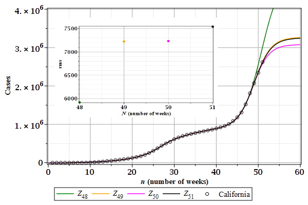
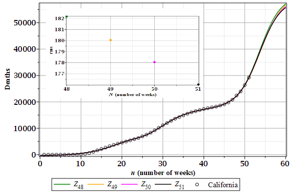
4.1. California
Figures 1 and 2 show the \(Z_{N}(n)\) curves describing weekly cases of contamination and deaths by Covid-19 in California (CA). The root mean square deviations are shown in the details.
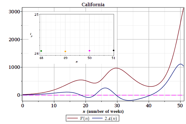
Figures 3 and 4 show the growth rates, speed $V(n)$ and acceleration $A(n)$, derived from the last curves $Z_{N}(n)$. The inflection points $i_{p}$ shown in the details are from the first wave. There are at least three waves.
| Figure 1: Contamination. | Figure 2: Deaths. |
|---|---|
 |
 |
| Figure 3: Contamination.
|
Figure 4: Deaths.
|
|---|---|
 |
 |
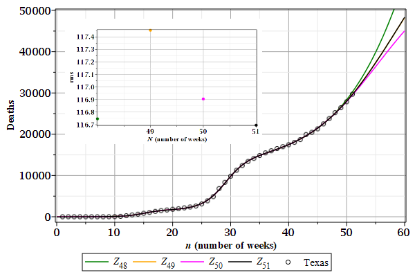
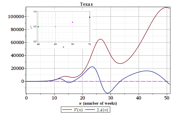
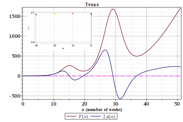
4.2. Texas
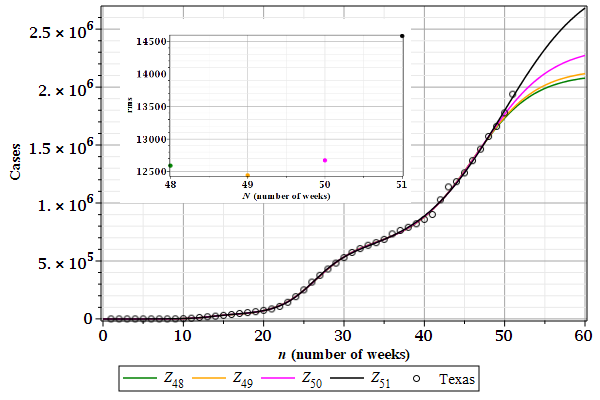
Figures 1 and 2 show the \(Z_{N}(n)\) curves describing weekly cases of contamination and deaths by Covid-19 in Texas (TX). The root mean square deviations are shown in the details.
Figures 3 and 4 show the growth rates, speed $V(n)$ and acceleration $A(n)$, derived from the last curves $Z_{N}(n)$. The inflection points $i_{p}$ shown in the details are from the first wave. There are at least three waves.
| Figure 1: Contamination. | Figure 2: Deaths. |
|---|---|
 |
 |
| Figure 3: Contamination.
|
Figure 4: Deaths. |
|---|---|
 |
 |
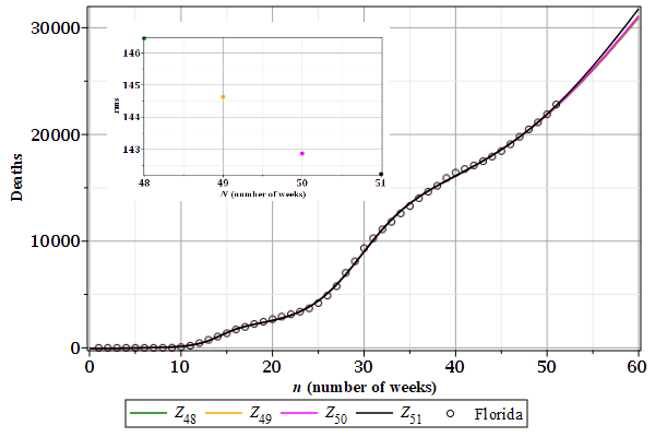
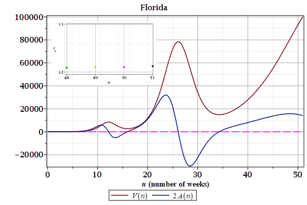
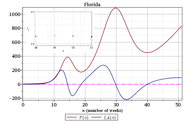
4.3. Florida
Figures 1 and 2 show the \(Z_{N}(n)\) curves describing weekly cases of contamination and deaths by Covid-19 in Florida (FL). The root mean square deviations are shown in the details.
Figures 3 and 4 show the growth rates, speed $V(n)$ and acceleration $A(n)$, derived from the last curves $Z_{N}(n)$. The inflection points $i_{p}$ shown in the details are from the first wave. There are at least three waves.
| Figure 1: Contamination. | Figure 2: Deaths. |
|---|---|
 |
 |
| Figure 3: Contamination.
|
Figure 4: Deaths.
|
|---|---|
 |
 |
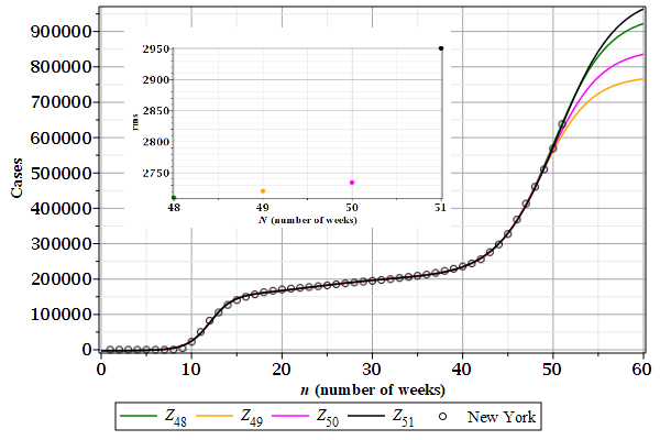
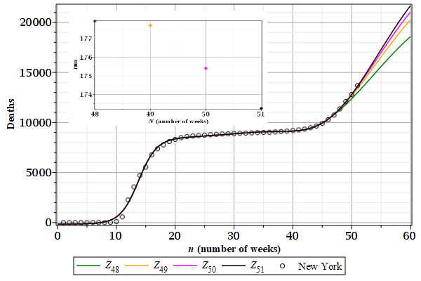
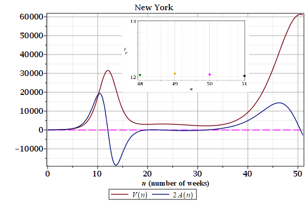
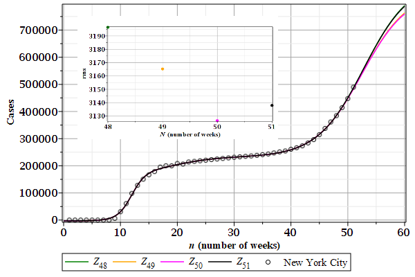
4.4. New York
Figures 1 and 2 show the \(Z_{N}(n)\) curves describing weekly cases of contamination and deaths by Covid-19 in New York (NY). The root mean square deviations are shown in the details.
Figures 3 and 4 show the growth rates, speed $V(n)$ and acceleration $A(n)$, derived from the last curves $Z_{N}(n)$. The inflection points $i_{p}$ shown in the details are from the first wave. There are at least three waves.
| Figure 1: Contamination. | Figure 2: Deaths. |
|---|---|
 |
 |
| Figure 3: Contamination.
|
Figure 4: Deaths.
|
|---|---|
 |
 |
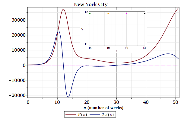
4.5. New York City
Figures 1 and 2 show the \(Z_{N}(n)\) curves describing weekly cases of contamination and deaths by Covid-19 in New York City (NYC). The root mean square deviations are shown in the details.
Figures 3 and 4 show the growth rates, speed $V(n)$ and acceleration $A(n)$, derived from the last curves $Z_{N}(n)$. The inflection points $i_{p}$ shown in the details are from the first wave. There are at least three waves.
| Figure 1: Contamination. | Figure 2: Deaths. |
|---|---|
|

|
| Figure 3: Contamination.
|
Figure 4: Deaths.
|
|---|---|
|

|
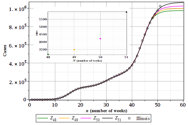
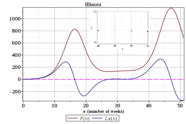
4.6. Illinois
Figures 1 and 2 show the \(Z_{N}(n)\) curves describing weekly cases of contamination and deaths by Covid-19 in Illinois (IL). The root mean square deviations are shown in the details.
Figures 3 and 4 show the growth rates, speed $V(n)$ and acceleration $A(n)$, derived from the last curves $Z_{N}(n)$. The inflection points $i_{p}$ shown in the details are from the first wave. There are at least three waves.
| Figure 1: Contamination. | Figure 2: Deaths. |
|---|---|
 |
 |
| Figure 3: Contamination.
|
Figure 4: Deaths.
|
|---|---|
 |
 |
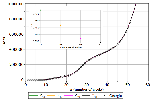
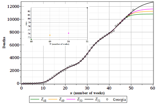
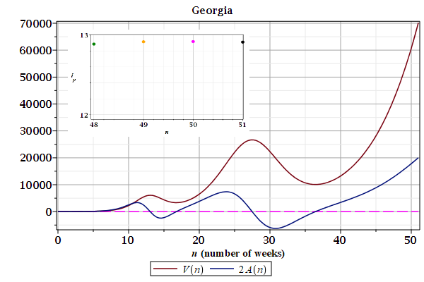
4.7. Georgia
Figures 1 and 2 show the \(Z_{N}(n)\) curves describing weekly cases of contamination and deaths by Covid-19 in Georgia (GA). The root mean square deviations are shown in the details.
Figures 3 and 4 show the growth rates, speed $V(n)$ and acceleration $A(n)$, derived from the last curves $Z_{N}(n)$. The inflection points $i_{p}$ shown in the details are from the first wave. There are at least three waves.
| Figure 1: Contamination. | Figure 2: Deaths. |
|---|---|
 |
 |
| Figure 3: Contamination.
|
Figure 4: Deaths.
|
|---|---|
 |
 |
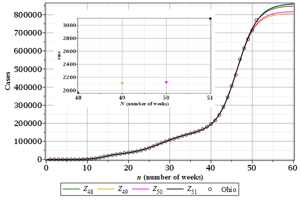
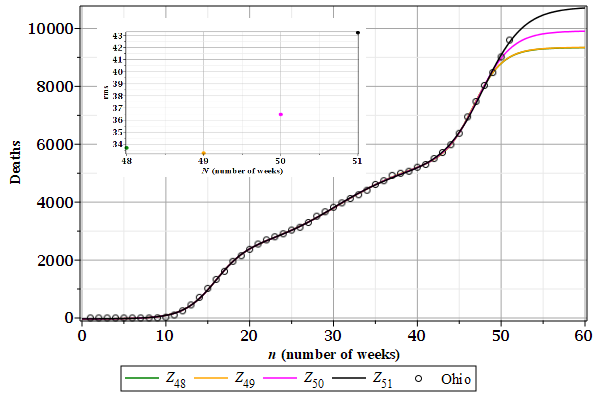
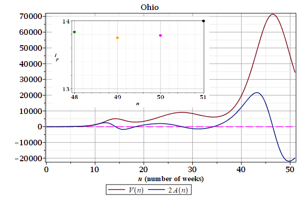
4.8. Ohio
Figures 1 and 2 show the \(Z_{N}(n)\) curves describing weekly cases of contamination and deaths by Covid-19 in Ohio (OH). The root mean square deviations are shown in the details.
Figures 3 and 4 show the growth rates, speed $V(n)$ and acceleration $A(n)$, derived from the last curves $Z_{N}(n)$. The inflection points $i_{p}$ shown in the details are from the first wave. There are at least three waves.
| Figure 1: Contamination. | Figure 2: Deaths. |
|---|---|
 |
 |
| Figure 3: Contamination.
|
Figure 4: Deaths.
|
|---|---|
 |
 |
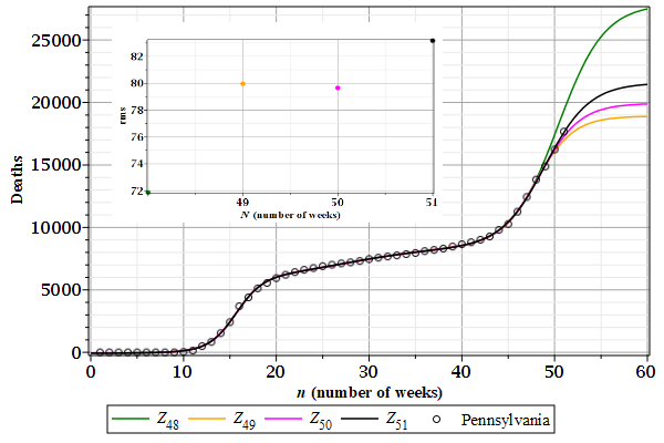
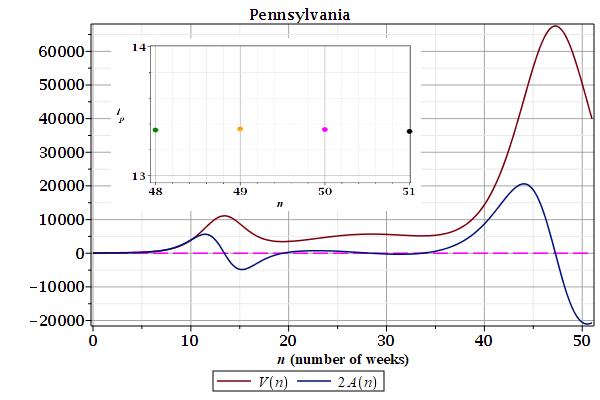
4.9. Pennsylvania
Figures 1 and 2 show the \(Z_{N}(n)\) curves describing weekly cases of contamination and deaths by Covid-19 in Pennsylvania (PA). The root mean square deviations are shown in the details.
Figures 3 and 4 show the growth rates, speed $V(n)$ and acceleration $A(n)$, derived from the last curves $Z_{N}(n)$. The inflection points $i_{p}$ shown in the details are from the first wave. There are at least three waves.
| Figure 1: Contamination. | Figure 2: Deaths. |
|---|---|
 |
 |
| Figure 3: Contamination.
|
Figure 4: Deaths.
|
|---|---|
 |
 |
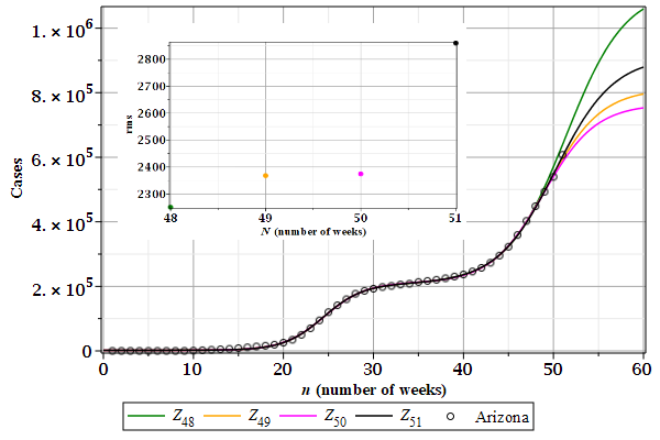
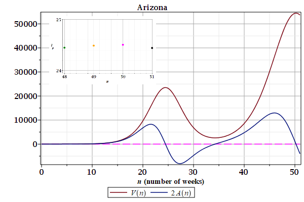
4.10. Arizona
Figures 1 and 2 show the \(Z_{N}(n)\) curves describing weekly cases of contamination and deaths by Covid-19 in Arizona (AZ). The root mean square deviations are shown in the details.
Figures 3 and 4 show the growth rates, speed $V(n)$ and acceleration $A(n)$, derived from the last curves $Z_{N}(n)$. The inflection points $i_{p}$ shown in the details are from the first wave. There are at least three waves.
| Figure 1: Contamination. | Figure 2: Deaths. |
|---|---|
 |
 |
| Figure 3: Contamination.
|
Figure 4: Deaths.
|
|---|---|
 |
 |
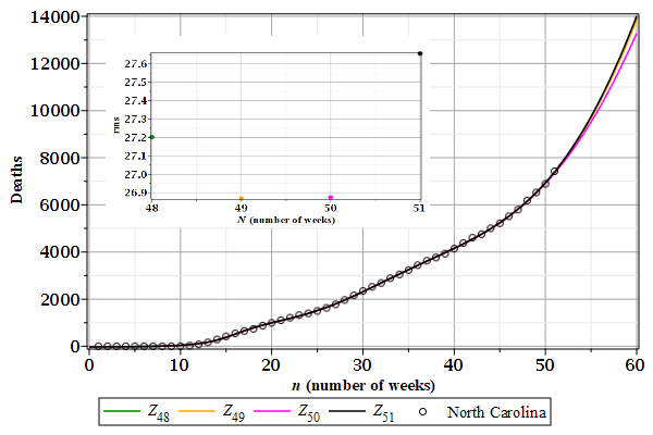
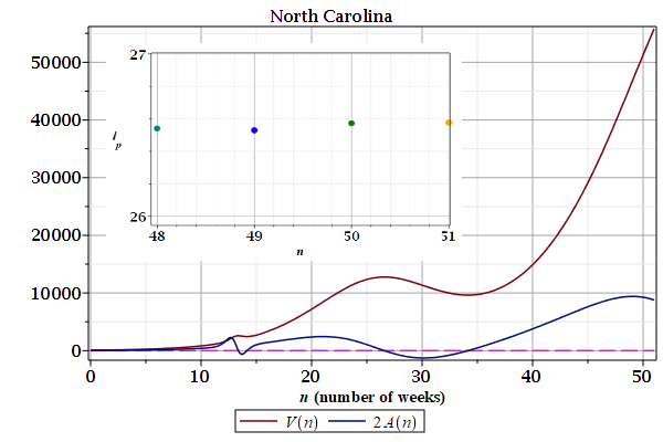
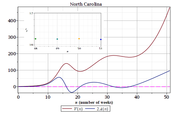
4.11. North Carolina
Figures 1 and 2 show the \(Z_{N}(n)\) curves describing weekly cases of contamination and deaths by Covid-19 in North Carolina (NC). The root mean square deviations are shown in the details.
Figures 3 and 4 show the growth rates, speed $V(n)$ and acceleration $A(n)$, derived from the last curves $Z_{N}(n)$. The inflection points $i_{p}$ shown in the details are from the first wave. There are at least three waves.
| Figure 1: Contamination. | Figure 2: Deaths. |
|---|---|
 |
 |
| Figure 3: Contamination.
|
Figure 4: Deaths.
|
|---|---|
 |
 |
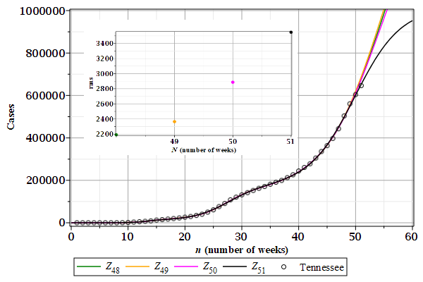
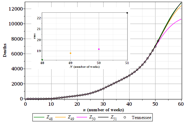
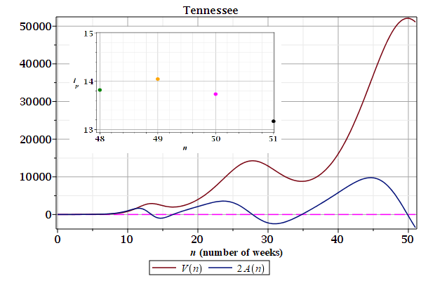
4.12. Tennessee
Figures 1 and 2 show the \(Z_{N}(n)\) curves describing weekly cases of contamination and deaths by Covid-19 in Tennessee (TN). The root mean square deviations are shown in the details.
Figures 3 and 4 show the growth rates, speed $V(n)$ and acceleration $A(n)$, derived from the last curves $Z_{N}(n)$. The inflection points $i_{p}$ shown in the details are from the first wave. There are at least three waves.
| Figure 1: Contamination. | Figure 2: Deaths. |
|---|---|
 |
 |
| Figure 3: Contamination.
|
Figure 4: Deaths.
|
|---|---|
 |
 |
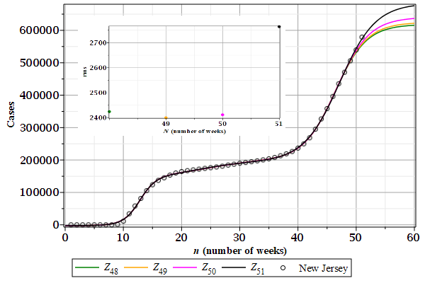
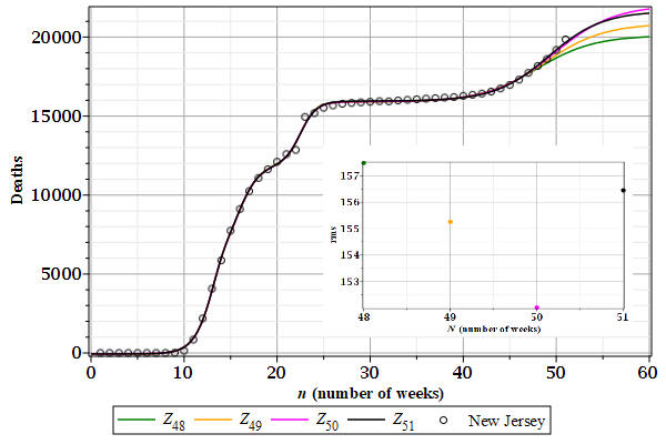
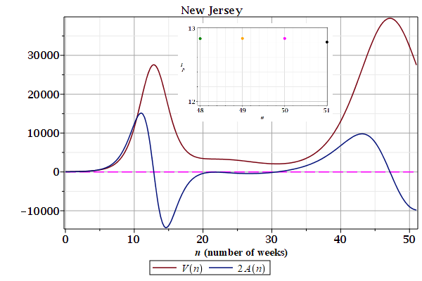
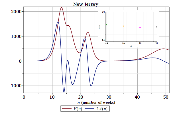
4.13. New Jersey
Figures 1 and 2 show the \(Z_{N}(n)\) curves describing weekly cases of contamination and deaths by Covid-19 in New Jersey (NJ). The root mean square deviations are shown in the details.
Figures 3 and 4 show the growth rates, speed $V(n)$ and acceleration $A(n)$, derived from the last curves $Z_{N}(n)$. The inflection points $i_{p}$ shown in the details are from the first wave. There are at least three waves.
| Figure 1: Contamination. | Figure 2: Deaths. |
|---|---|
 |
 |
| Figure 3: Contamination.
|
Figure 4: Deaths.
|
|---|---|
 |
 |
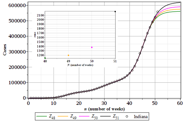
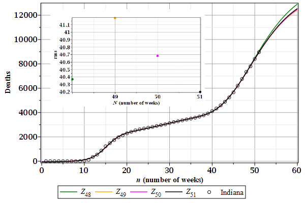
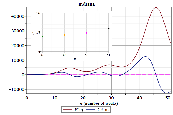
4.14. Indiana
Figures 1 and 2 show the \(Z_{N}(n)\) curves describing weekly cases of contamination and deaths by Covid-19 in Indiana (IN). The root mean square deviations are shown in the details.
Figures 3 and 4 show the growth rates, speed $V(n)$ and acceleration $A(n)$, derived from the last curves $Z_{N}(n)$. The inflection points $i_{p}$ shown in the details are from the first wave. There are at least three waves.
| Figure 1: Contamination. | Figure 2: Deaths. |
|---|---|
 |
 |
| Figure 3: Contamination.
|
Figure 4: Deaths.
|
|---|---|
 |
 |
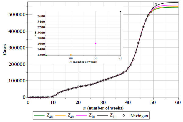
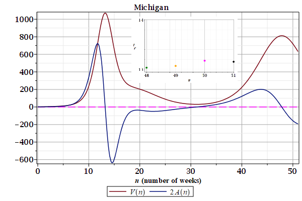
4.15. Michigan
Figures 1 and 2 show the \(Z_{N}(n)\) curves describing weekly cases of contamination and deaths by Covid-19 in Michigan (MI). The root mean square deviations are shown in the details.
Figures 3 and 4 show the growth rates, speed $V(n)$ and acceleration $A(n)$, derived from the last curves $Z_{N}(n)$. The inflection points $i_{p}$ shown in the details are from the first wave. There are at least three waves.
| Figure 1: Contamination. | Figure 2: Deaths. |
|---|---|
 |
 |
| Figure 3: Contamination.
|
Figure 4: Deaths.
|
|---|---|
 |
 |
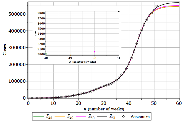
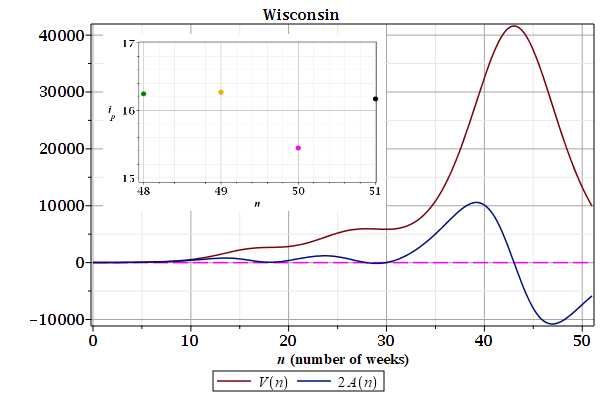
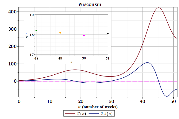
4.16. Wisconsin
Figures 1 and 2 show the \(Z_{N}(n)\) curves describing weekly cases of contamination and deaths by Covid-19 in Wisconsin (WI). The root mean square deviations are shown in the details.
Figures 3 and 4 show the growth rates, speed $V(n)$ and acceleration $A(n)$, derived from the last curves $Z_{N}(n)$. The inflection points $i_{p}$ shown in the details are from the first wave. There are at least three waves.
| Figure 1: Contamination. | Figure 2: Deaths. |
|---|---|
 |
 |
| Figure 3: Contamination.
|
Figure 4: Deaths.
|
|---|---|
 |
 |
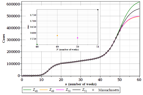
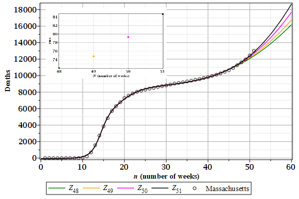
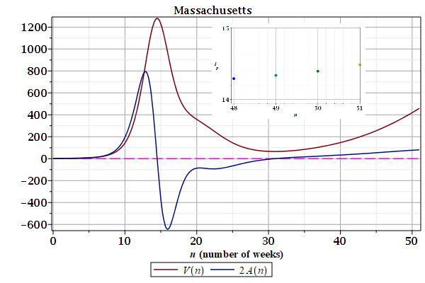
4.17. Massachusetts
Figures 1 and 2 show the \(Z_{N}(n)\) curves describing weekly cases of contamination and deaths by Covid-19 in Massachusetts (MA). The root mean square deviations are shown in the details.
Figures 3 and 4 show the growth rates, speed $V(n)$ and acceleration $A(n)$, derived from the last curves $Z_{N}(n)$. The inflection points $i_{p}$ shown in the details are from the first wave. There are at least three waves.
| Figure 1: Contamination. | Figure 2: Deaths. |
|---|---|
 |
 |
| Figure 3: Contamination.
|
Figure 4: Deaths.
|
|---|---|
 |
 |
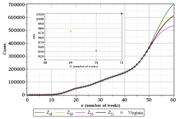
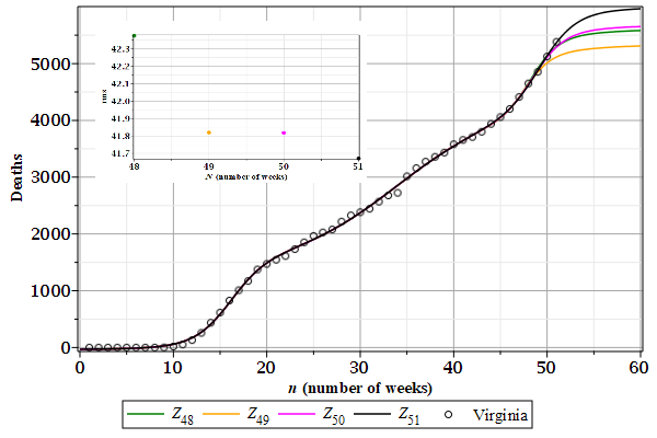
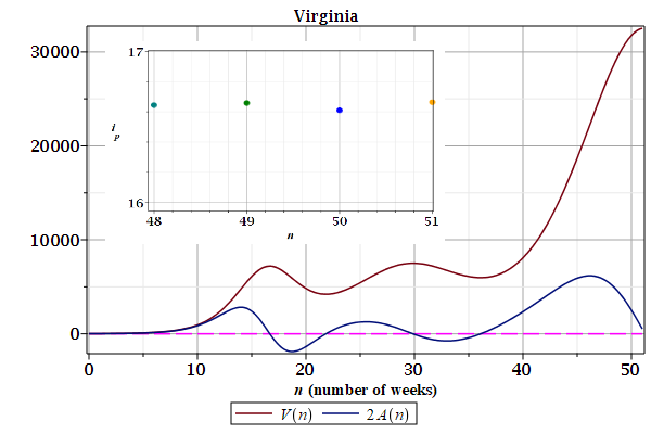
4.18. Virginia
Figures 1 and 2 show the \(Z_{N}(n)\) curves describing weekly cases of contamination and deaths by Covid-19 in Virginia (VA). The root mean square deviations are shown in the details.
Figures 3 and 4 show the growth rates, speed $V(n)$ and acceleration $A(n)$, derived from the last curves $Z_{N}(n)$. The inflection points $i_{p}$ shown in the details are from the first wave. There are at least three waves.
| Figure 1: Contamination. | Figure 2: Deaths. |
|---|---|
 |
 |
| Figure 3: Contamination.
|
Figure 4: Deaths.
|
|---|---|
 |
 |
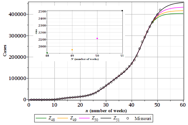
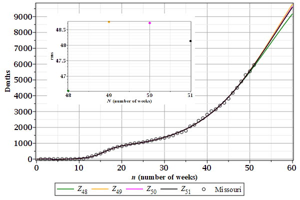
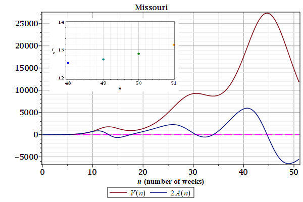
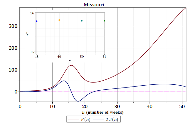
4.19. Missouri
Figures 1 and 2 show the \(Z_{N}(n)\) curves describing weekly cases of contamination and deaths by Covid-19 in Missouri (MO). The root mean square deviations are shown in the details.
Figures 3 and 4 show the growth rates, speed $V(n)$ and acceleration $A(n)$, derived from the last curves $Z_{N}(n)$. The inflection points $i_{p}$ shown in the details are from the first wave. There are at least three waves.
| Figure 1: Contamination. | Figure 2: Deaths. |
|---|---|
 |
 |
| Figure 3: Contamination.
|
Figure 4: Deaths.
|
|---|---|
 |
 |
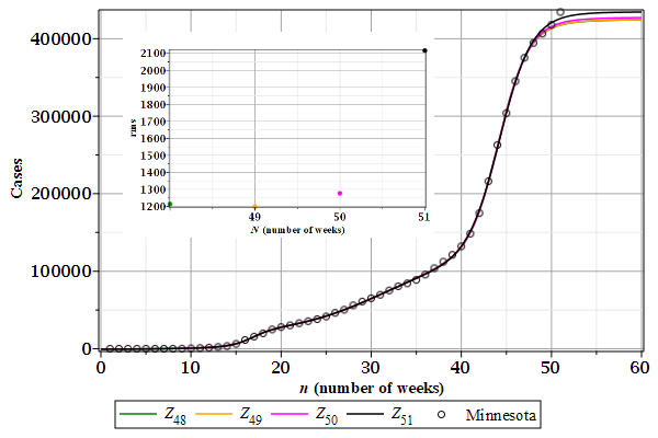
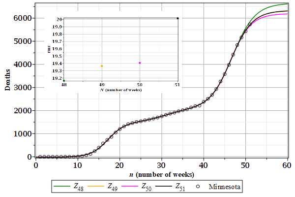
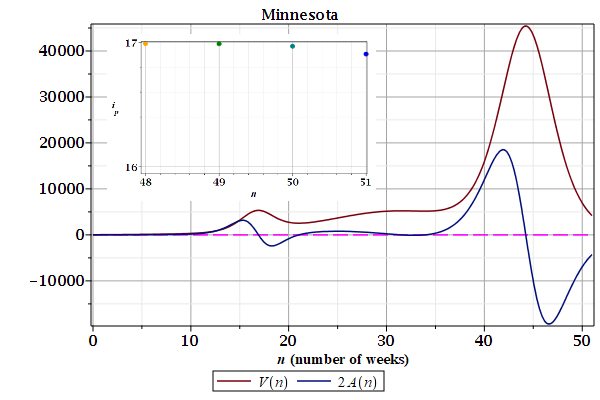
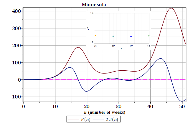
4.20. Minnesota
Figures 1 and 2 show the \(Z_{N}(n)\) curves describing weekly cases of contamination and deaths by Covid-19 in Minnesota (MN). The root mean square deviations are shown in the details.
Figures 3 and 4 show the growth rates, speed $V(n)$ and acceleration $A(n)$, derived from the last curves $Z_{N}(n)$. The inflection points $i_{p}$ shown in the details are from the first wave. There are at least three waves.
| Figure 1: Contamination. | Figure 2: Deaths. |
|---|---|
 |
 |
| Figure 3: Contamination.
|
Figure 4: Deaths.
|
|---|---|
 |
 |
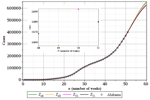
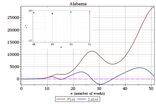
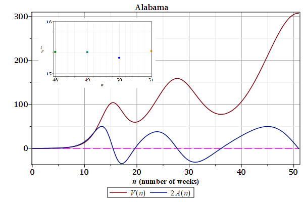
4.21. Alabama
Figures 1 and 2 show the \(Z_{N}(n)\) curves describing weekly cases of contamination and deaths by Covid-19 in Alabama (AL). The root mean square deviations are shown in the details.
Figures 3 and 4 show the growth rates, speed $V(n)$ and acceleration $A(n)$, derived from the last curves $Z_{N}(n)$. The inflection points $i_{p}$ shown in the details are from the first wave. There are at least three waves.
| Figure 1: Contamination. | Figure 2: Deaths. |
|---|---|
 |
 |
| Figure 3: Contamination.
|
Figure 4: Deaths.
|
|---|---|
 |
 |
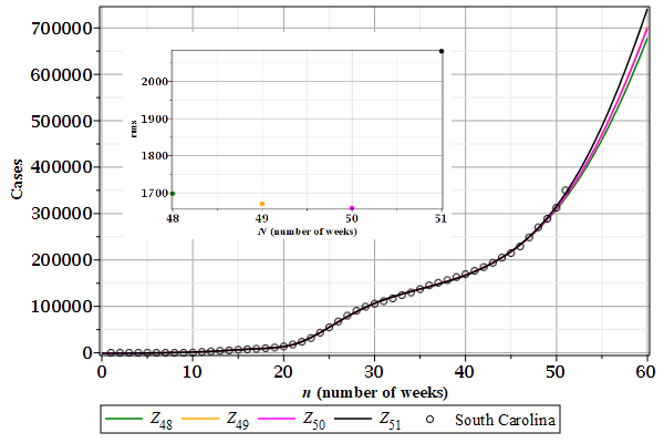
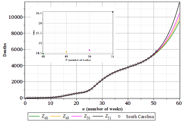
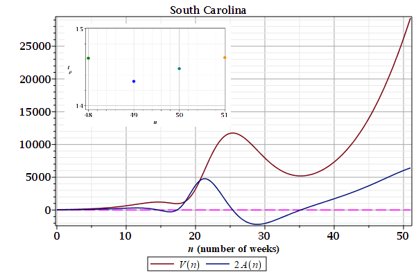
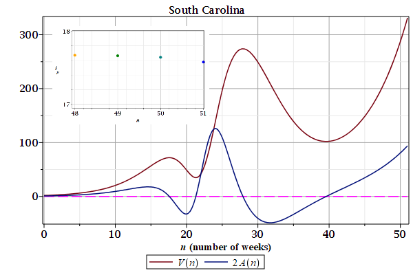
4.22. South Carolina
Figures 1 and 2 show the \(Z_{N}(n)\) curves describing weekly cases of contamination and deaths by Covid-19 in South Carolina (SC). The root mean square deviations are shown in the details.
Figures 3 and 4 show the growth rates, speed $V(n)$ and acceleration $A(n)$, derived from the last curves $Z_{N}(n)$. The inflection points $i_{p}$ shown in the details are from the first wave. There are at least three waves.
| Figure 1: Contamination. | Figure 2: Deaths. |
|---|---|
 |
 |
| Figure 3: Contamination.
|
Figure 4: Deaths.
|
|---|---|
 |
 |
4.23. next
Figures 1 and 2 show the \(Z_{N}(n)\) curves describing weekly cases of contamination and deaths by Covid-19 in California (CA). The root mean square deviations are shown in the details.
Figures 3 and 4 show the growth rates, speed $V(n)$ and acceleration $A(n)$, derived from the last curves $Z_{N}(n)$. The inflection points $i_{p}$ shown in the details are from the first wave. There are at least three waves.
| Figure 1: Contamination. | Figure 2: Deaths. |
|---|---|
|
|
| Figure 3: Contamination.
|
Figure 4: Deaths.
|
|---|---|